Communicating error messages accessibly

Almost a year ago there was a discussion about accessible error messages in the WebAIM forums. Based on that discussion I take a look at how you can create accessible (and usable) error messages for your web applications.

Errors in web applications be divided into two groups:

  1. Server errors e.g. 404 Page not found and other HTTP protocol errors.
  2. Application errors e.g. The ‘Name’ field can not be empty. and other errors that your web based application will present to the user.

This article will deal with number 2: application errors. If you are more interested in server errors I suggest you have a look at The Perfect 404 by Ian Lloyd.

Proposal for accessible error messages

I propose the following requirements for error message presentation in web applications:

  1. Error messages should be accessible for as many users as possible regardless of culture, age and impairment.
  2. It should be easy to understand that an error has occurred.
  3. It should be clear what the user has to do to correct the error.
  4. It should be clear for the user where the error was found in the form.
  5. It should be possible to be notified about errors before submitting the form, especially if it is a complex form that takes time to process on the server.
  6. All errors should be displayed at the same time. No one wants to re-submit the form to find a new error.

I assume you already know how to create accessible forms and styling them properly so that sighted users can understand them. If you need more information about forms, please see the references at the end of this article.

Let’s see what we have to do to comply with the above requirements:

Visual presentation of errors

  • Make sure the user can see that an error has occurred. Error messages need to stand out from the rest of the layout. They should be placed at the top of the page if that is the area displayed after the form has been submitted with errors.
  • Use an error icon if your layout makes it difficult to visually separate errors from the rest of the page.
  • Be consistent when you present errors (the user will expect errors to be displayed at the same location and with the same style on all pages).
  • Update the page title to indicate that the user is on the same page but with errors (e.g. if the page title is “Registration” you could change it to “Registration – Error occurred”).

The error message text

  • Make sure the error message identifies the related field with the name as it is written in the label for that field.
  • Do not use complicated words. (tip: check out Ogdens basic english)
  • Describe what the user should do to correct the error, especially if it could be difficult to understand.
  • Make it clear if there were more than one error so that the user can correct all errors at once.

Markup of error messages

  • Make sure all user agents can parse error details. Use a heading to identify the error area.
  • Present each error as an item in a list. This makes it easy for the user to understand what has to be corrected. Also, screen reader users will find it easier to keep errors apart.
  • If you use software specific error id numbers (most developers do) do not hesitate to add them to the id-attribute of the li element. If you use automated functional tests (e.g. Rational Robot) it will be much easier for the test robot to parse and identify errors.
  • Provide an accesskey for the error message section. This is valuable if your form can generate many errors and enables the user to move back and forth between the error list and the form.
  • Make it possible to navigate from the error message to the related field. This makes it easier for users that navigate with the keyboard.

Client side validation

Using client side validation has many advantages. Users can get instant feedback instead of having to wait for a server roundtrip. Server load is also reduced. However, there are some things to take into consideration:

  • Never rely on client side validation alone. Only use it as a complement to server side validation.
  • Users must be able to submit the form and trigger server side validation even if client side validation failed. Some browsing devices (e.g. screen readers) will not understand that the page has been dynamically updated (with your error messages). This means that users will not understand why the form submission failed. One way of using client side validation is to trigger it when a field loses focus (on the onblur event).
  • Be careful when using the ASP.NET validation controls. By default ASP.NET will prevent form submission until the form is valid. For information on how to allow form submission with errors see Disabling Validation for ASP.NET Server Controls.

An example

Enough talking, let’s look at an example:

Error message sample

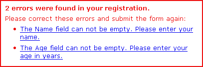
The markup for this sample error section with two errors looks like this:

<div id="validationerror">
  <h2 id="errorsummary">2 errors were found in your registration.</h2>
  <p>Please correct these errors and submit the form again:</p>
  <ul>
    <li id="er_128">
    <a href="#name" onclick="setfocus('name')">
    The Name field can not be empty.
    Please enter your name.</a></li>
    <li id="er_215">
    <a href="#age" onclick="setfocus('age')">
    The Age field can not be empty.
    Please enter your age in years.</a></li>
  </ul>
</div>

Clicking the validation error link triggers this simple javascript function:

function setfocus(objectid) { if(document.getElementById(objectid)) { document.getElementById(objectid).focus(); } }

Click here to see the complete validation error example. Evaluating the result can be done by looking at the personas from Mark Pilgrim’s excellent Dive into Accessibility. If you do not have access to a real test panel using personas is the next best thing.

Update: Reader Tanny O'Haley suggested that the label element should be used instead of setting focus with javascript. See details in comment 9 and 10 below.

I would be very happy for your comments and suggestions.

References

  1. Accessible form validation errors (WebAIM forum discussion).
  2. Disabling Validation for ASP.NET Server Controls.
  3. Client-Side Validation for ASP.NET Server Controls.
  4. IBM Accessibility center – Indicating required fields.
  5. Cross browser CSS :focus by Paul Griffin. Describes how you can use the focus pseudoclass in Internet Explorer (not used in the example in this article).
  6. AJAX and Accessibility.
  7. (about server errors) The Perfect 404 by Ian Lloyd.

Comments

  1. Roger Johansson says at 2005-06-25 20:06:

    Great article, Pete! One question about the client side validation: would you suggest presenting the errors in a JavaScript alert or on the page?

  2. Pete says at 2005-06-25 21:06:

    Roger: Thank you. Although alerts are visible for JAWS users I would not recommend them for forms with more than one field. If you have many fields I believe alerts may be annoying if you get them repeatedly while filling out the form.

  3. John says at 2005-06-25 23:06:

    Some good points, but then I was shocked by the wording of your message. It is a throwback to the “User did error” messages of the past. It is impolite (to put it mildly) to accuse the user of an “error”. The message might (apologetically) ask the user to complete the missing fields; it might refer to them as a “problem”, but these days, “error” is too strong. Computers do errors, not users (that’s more a statement of attitude than fact).

  4. Roger Johansson says at 2005-06-26 00:06:

    Pete: I was thinking more along the lines of doing the validation on submit and present all errors (or “problems” – good point, John) in a single alert.

  5. Jeroen Mulder says at 2005-06-26 00:06:

    I really, really like the simply, but effictive, focus changes. I’ve always been a fan of presenting (a summary) of the errors at the top of the form, allowing the user to click on it and quickly go to the element is smart.

    Why didn’t I think of that? ;-)

  6. Pete says at 2005-06-26 00:06:

    John: You may be corrent. English is not my first language and I sometimes fail to use the correct words. However, the example in the WebAIM discussion talks about “errors”. Does anyone else have any suggestions for terminology? What would be a polite way of informing the user about validation errors?

  7. Jeroen Mulder says at 2005-06-26 00:06:

    Pete, I do use the word ‘error’, but from a difference perspective.

    “An error occured while saving your new article. Please ensure the article title is not blank.”

    I tend to think that says the error was on our side, but the user might want to check for the following requirements. Granted, english isn’t my first language either. ;-)

  8. Martin Smales says at 2005-06-26 10:06:

    Great article, although, it can be improved by replacing onclick events with CSS class names, giving way to unobtrusive JavaScript.

    How-to: http://adactio.com/atmedia2005/

  9. Tanny O'Haley says at 2005-06-26 19:06:

    Very nice article, although, I would replace the onclick events with label elements. If the user has javascript turned off the browser should put focus on the field when the user clicks or selects the label.

    John,

    I’m sorry you were shocked by the use of the word error. One of the definitions of error is:

    n 1: a wrong action attributable to bad judgment or ignorance or inattention;

    I believe that this applies to a user who has not entered data or has entered incorrect data in a field. The word “error” has been used for informing a user of invalid data since before I started programming in 1980. Used in this context would be considered “common” usage.

  10. Pete says at 2005-06-27 10:06:

    Tanny: That is a good suggestion and I have made an example with the label element here. The HTML spec allows for multiple label elements for the same field. However, I would recommend that the label element in the error text only spans the name of the field in order to avoid confusion for browsing devices that may display form information in a different context. One drawback of this method is that users navigating without a mouse are unable to click the error message (it is not highlighted as a link). Other users may miss that it is clickable becasue the label does not look like a link. This could be taken care of in the CSS of course.

    Martin: Attaching event handling code on window.onload should be done with caution (even if it is a nice way to separate script from markup). In my experience from Fangs I have noticed that for large DOMs it may take a while to find elements and modify them. In that time users may already have clicked something or done something else that prevents all the event handling code from being set.

    Roger: I am not sure if I understand exactly how you would do it. Are you thinking an alert or a modal dialog window? For alerts there are som drawbacks: How would you allow the user to submit the form without fixing the errors first if your alert is triggered by the submit button? Alerts are harder to format nicely and there is no semantic information. This is of course bad for multiple errors if you are using e.g. JAWS.

  11. Roger Johansson says at 2005-06-30 19:06:

    That would probably have to be a confirm dialog to allow the form to be submitted without fixing the errors, that’s right.

    Presenting the problems on the page is probably better, but less obvious.

  12. Terrence Wood says at 2005-07-06 03:07:

    A suggestion for friendly error messages.

    “We were unable to process your form. Some information was either missing or not understood.

    Please check the following, and submit the form again:

    * The Name field can not be empty. Please enter your name.
    * The Age field can not be empty. Please enter your age in years.”

  13. Rich says at 2005-07-11 21:07:

    Nice article. As a jaws user, I’d suggest the setfocus approach (the one originally discussed in the article). The ability to click on the error message itself and be taken right to the erroneous input is nice.

    Maybe one suggestion would be to issue an alert, even if multiple errors were found. The alert would simply say “We had trouble processing your form. See specific error messages on tthe following page (or something like that).” The idea being that the alert is beeps and can alert the screen reader user that the submission failed. Its sometimes easy to not notice error messages because there is no way to make them jump out at you when using a screen reader. Using a heading to introduce a list of errors is the right thing to do, but it is only findable if the user goes and looks; it doesn’t jump up and announce itself. So, having a number of different ways of making the fact known that an error was found is the thing to do. So, a heading introducing a list of errors, an indication in the page title itself (sometimes the page title is announced by the screen reader when the page is refreshed), and an alert announcing that there were problems and twhere to look for more info are all helpful mechanisms to apply in tandem.

  14. web designer says at 2005-08-26 14:08:

    great article.

  15. vp says at 2005-09-16 14:09:

    I won’t make the full sentence a link I prefer this

    The Age field can not be empty.

    Please <a href=”self.php#age”>enter your age</a href> in years.

    so the user can guess he can follow a link (otherwise he only sees a sentence with emphasis (=underlined))

    You should provide a valid exemple …age in years (eg: 21) and not “twenty-one”

Peter Krantz, peter.krantz@giraffe.gmail.com (remove giraffe).