Here are my initial thoughts on how I believe RDFa will benefit web accessibility. If you are new to RDFa I recommend reading the Wikipedia entry on RDFa and the W3C RDFa primer as an introduction. Continue reading “RDFa – Implications for Accessibility”
Mental Workload for Paged and Scrolled Documents
In a recent doctoral thesis from the department of psychology at Gothenburg University, Sweden, Erik Wästlund provides some interesting findings on mental workload for consumption of information. Two of the principal findings are:
- Consumption of information is more efficient when information is presented on paper compared to presenting the information on a computer screen.
- Consumption of information generates less mental workload when the page layout is adapted to fit the screen.
The first point may not come as a surprise. Steve Krug has argued that users tend to scan web pages rather than read them and Erik’s study cites previous research that says users tend to have difficulties reading longer passages of text on a screen.
A fundamental characteristic of reading information on a computer screen is that it “involves both the process of reading the presented text and handling the computer. The reader’s processing capacity is being utilized not only for decoding but also for page navigation.”. When we read e.g. a book the mental workload is low because we know from experience where to focus after turning a page.
Adapting content to the screen
The second point has some interesting implications for people working with the web. Currently, web pages with a lot of text tend to come in two flavors:
- All text on a single web page and the standard browser scrollbar to move forward in the page. (Example: A review of the Web Content Accessibility Guidelines 2.0, May 2007 Working Draft).
- Paged text and one or more navigation buttons to move to the next page. (Example: Mark Pilgrim’s Dive Into Accessibility, Day 6: Choosing a DOCTYPE).
Paged text on the web today is rarely adapted to the browser window size.
In Erik’s study the test subjects were given reading assignments. One group read the document in a scrolled format (number 1 above) and the other group read the document in a paged format where the page format was adapted to the computer screen.
The result showed that mental workload was lower when you read information in a paged way adapted to the screen. This is interesting as the current technology for constructung web pages (HTML and CSS) do not provide an easy way to page text adapted to the user’s screen. I am guessing that it may be possible by using javascript to measure the window size and create keys to move forward by a viewport page at the click of a button.
On the other hand, most browsers provide this functionality for scrolled pages in the Page-up and Page-down keys. In the usability tests I have participted in during the past years I can not recall a single user using the Page-up/down keys.
So, does this mean that scrolled text is better if user’s learn to navigate with the Page-up/down keys? Or should content authors paginate long documents? Will these methods have other accessibility implications?
Visually Editing Semantics – What You See Is What You Mean
Many CMSs (content management systems) come with some kind of visual editor that allow editors to create and format content without knowing the markup involved. I evaluated some of these WYSISYG-editors back in March and found most of them lacking in features for semantic markup. One of the more commonly found problems is that they have a lot of features for visual formatting like font selection, font color, indentation etc. In most CMSs these are features you would like to avoid (ask your corporate communication department if they would like to have features that allow editors to go crazy with colors on the website…).
Som of you will argue that one should never use a WYSIWYG editor and instead deploy a wiki-style editing syntax like e.g. Markdown. This typically solves the problem, but in reality this type of syntax is very difficult for content editors to learn and becomes increasingly difficult if you want to do more advanced editing.
WYMeditor to the rescue
I was planning to start working on my own inline editor by forking TinyMCE and correcting what I thought was wrong with it when I found this comment from Jean-François:
[…] I’d like to present WYMeditor: WYMeditor is a web-based XHTML editor, not WYSIWYG, but WYSIWYM: the end-user can concentrate on rich content, while layout and design are handled via style-sheets.
This sounded almost too good to be true. WYSIWYM (What You See Is What You Mean) is of course how content for the web should be edited. WYMeditor is in an early stage of development, but after playing with it for a while it looks very promising. If it guarantees well formed XHTML it is an easy task to convert it to HTML 4.01 or any other representation you can think of.
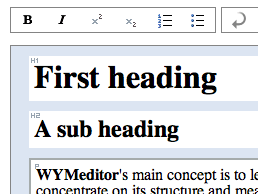
Currently it works in Internet Explorer and Gecko-based browsers such as Firefox. You can try an online demo of WYMeditor here.
If content management systems were to use editors like WYMeditor web accessibility would get and instant boost. There are some issues that hopefully will be solved soon:
- icons for strong emphasis and emphasis look like bold and italics,
- heading levels can be mixed in a non-logical way (like inserting h5 after h1)
- support for som elements like acronym, abbreviation and definition lists, are missing
But, if I was developing a CMS I would definitely monitor the progress of WYMeditor.
Could WYMeditor make content editors aware of semantics in a way currently impossible in other inline editors? Will this type of inline editing merge with visual presentation à la XStandard?
Don’t Provide an Accessibility Statement
When I surf the web I see more and more sites providing an accessibility statement. Googling for “accessibility statement” returns over twelve million pages. What do these statements contain? Why would you want one? Who reads them? This article will try to make two points: 1. accessibility statements are often pointless and 2. you are better off with a “site help” if you think your target audience need it.
Continue reading “Don’t Provide an Accessibility Statement”
Methods for measuring text readability
Content is often overlooked when working with a web site to increase accessibility. Even if your web site follows all W3C recommendations it will still be inaccessible if your content is difficult to comprehend. Let’s have a look at how you can measure text readability in english, spanish, swedish, danish and french to get a feel for the readability of your content.