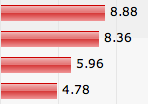
 Web site bar charts often consist of a fancy image exported from Microsoft Excel. If you are lucky someone wrote an alt-text explaining what the chart is about. It is time to stop doing that. In this article I show you how you can make an accessible bar chart without sacrificing visual pizzazz.
In this short article we’ll have a look at why image based charts are bad and what you can do about it.
Bar charts are used to give the user a visual overview of how values for something relate to each other. It also enables users to make their own comparisons of data items.
Most charts you find on the web today have been created in some sort of spreadsheet software such as Microsoft Excel or are automatically generated from data on the server. A confession: throughout the years I have implemented numerous chart components in software solutions for clients. The one thing they usually have in common is that they output images and have been inaccessible for many users.
Why image based charts are bad
We all know that using images to present information is bad for people who can not see images. Even if you add an alt-text explaining what the chart is about it may be difficult to provide a thorough explanation of all values and how they relate to each other. Sometimes it is difficult to automatically create an alt-text if the chart is dynamically created on the server.
The alt-texts for charts I find on the web are usually along the lines of “Bar chart showing GDP per capita”. As you can understand, this is close to useless information. But even if the author were to provide a thorough description of the chart data it would be difficult to get the information I am looking for. A long alt-text is a linear representation of the chart data which makes it difficult to “scan” the information.
What we want from a bar chart
Sighted users get a lot of information from a chart. They can scan the chart with their eyes and easily compare values for different items. They also get a sense of the difference between values – something which may help understanding the point the author is trying to make.
A lot of chart data is tabular by nature. One of the most common chart types used to present tabular data is the bar chart. On the web we use the table element to present tabular data (and avoid using it for layout!).
Here is what we would like to achieve:
- Present data in an accessible and browsable way for as many users as possible.
- Not give up visual pizzazz for sighted users.
- Stay compatible with server side creation of the chart from dynamic data.
A proposed solution
I would have preferred to make a chart in SVG but we have to accept that SVG is not here yet. So, let’s try to make a bar chart by doing some minor modifications to a plain html table. If we keep data in a table we maintain accessibility for screen reader software that allows the user to navigate back and forth between cells.
The accessible bar chart is here. It should be fairly obvious how it is made and how you can extend it. It would be easy to add more data series for example. Bar widths are calculated relative to the largest value in the chart. This can be done automatically on the server side for dynamic data. Using CSS it is possible to make the chart even more advanced.
I hope this can be of use to you.
Comments are closed.